

Rescuing one animal may not change the world, but for that animal, their world is changed forever.
The rising trend of pet adoption in India, driven by urbanization and emotional support needs, has led to a demand for a comprehensive adoption platform. While over 600,000 dogs are adopted annually, most platforms focus primarily on cats and dogs. A platform that includes all petable animals would address this gap, offering support and guidance for adopting a broader range of species. This would ensure that all animals receive the care and attention they need.
End-to-End UX Designer
Figma, Photoshop, Miro
I had an in-depth meeting with the stakeholders to understand their exact needs. I asked numerous
questions
about the rescue process and the challenges they face.
they expressed the following concerns and
goals:
The app's competitive analysis aims not to compete but to understand the market, evaluate existing solutions' successes and challenges, and uncover opportunities to address unmet needs effectively.
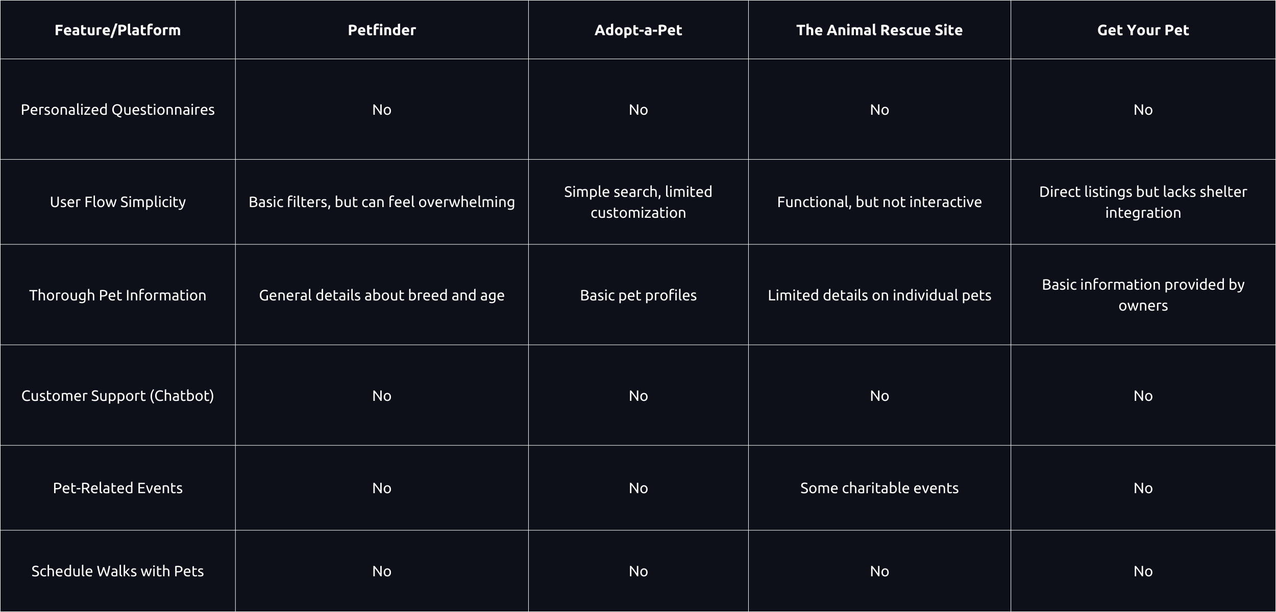
I conducted 15 interviews to explore user needs and pain points with existing pet adoption platforms, uncovering key gaps and opportunities for 'Buddy.'
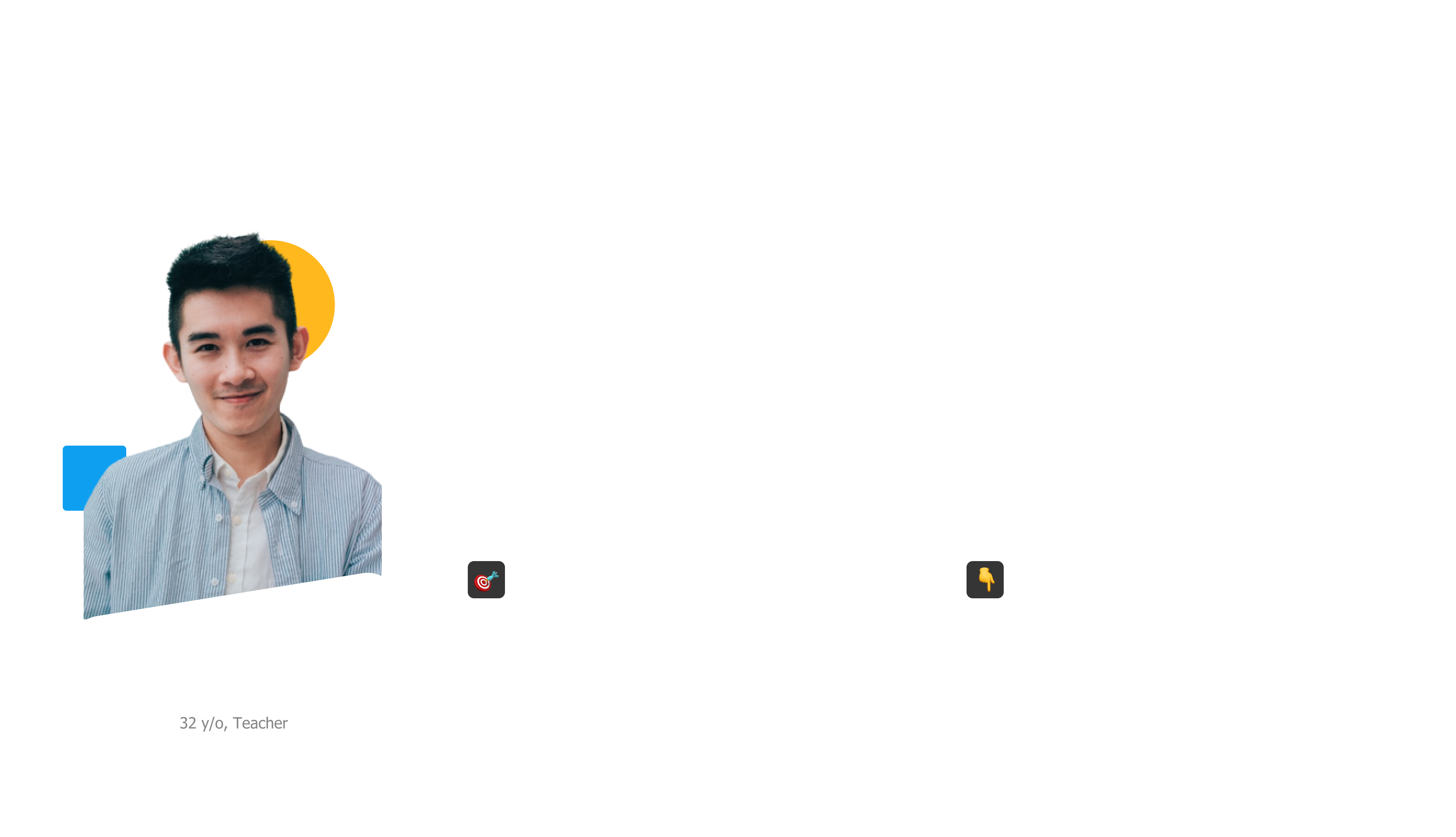
To understand the user better, I developed a user persona to represent our target audience.
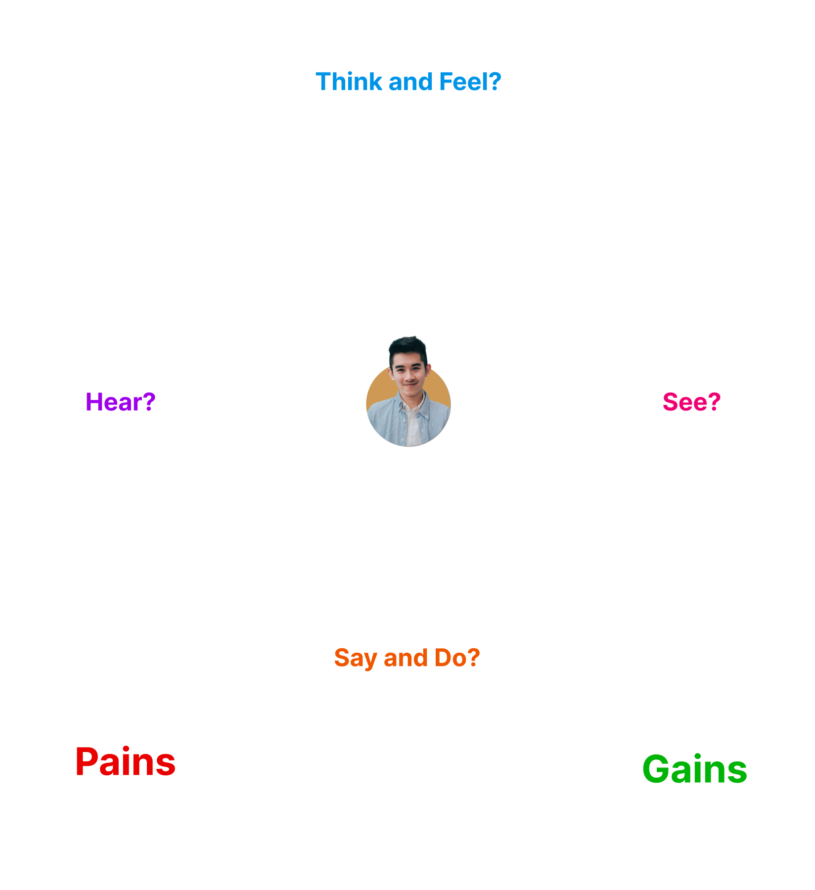
I created an empathy map to categorize and better understand how users hear, see, say, do, think, and feel about the pet adoption platform. This approach allowed me to tap into their frustrations, hopes, needs, and desires, helping me gain a deeper emotional understanding of their experiences and creating a more empathetic, user-centered design.
After the user interviews, competitive analysis and talking to Stakeholders I came up with following goal
To create a seamless and efficient user experience on the pet adoption platform, I applied the following UX principles:
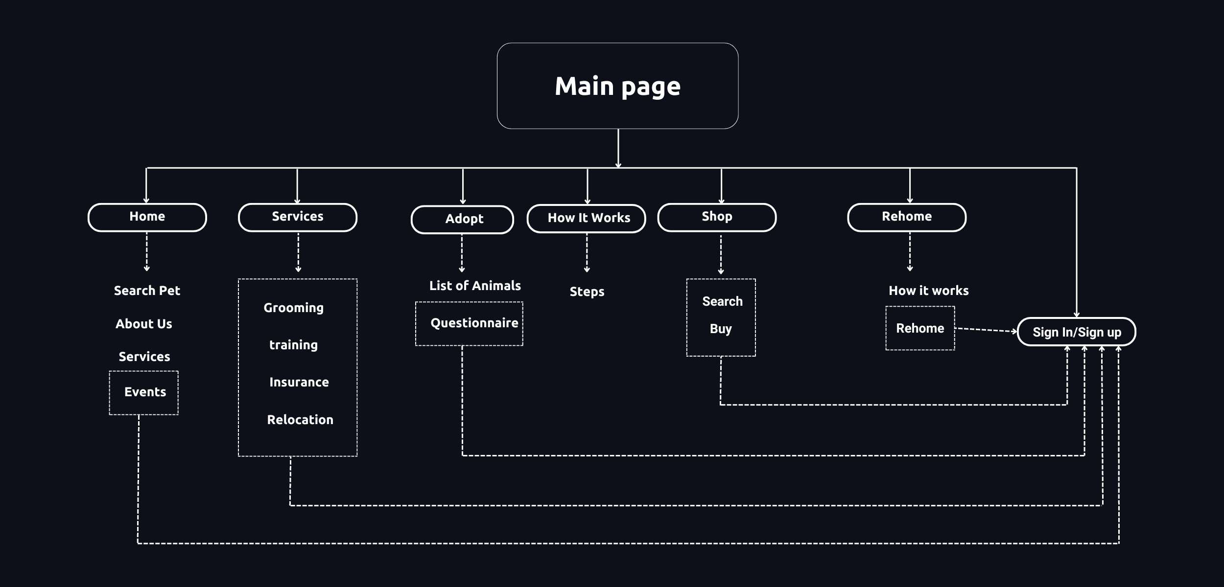
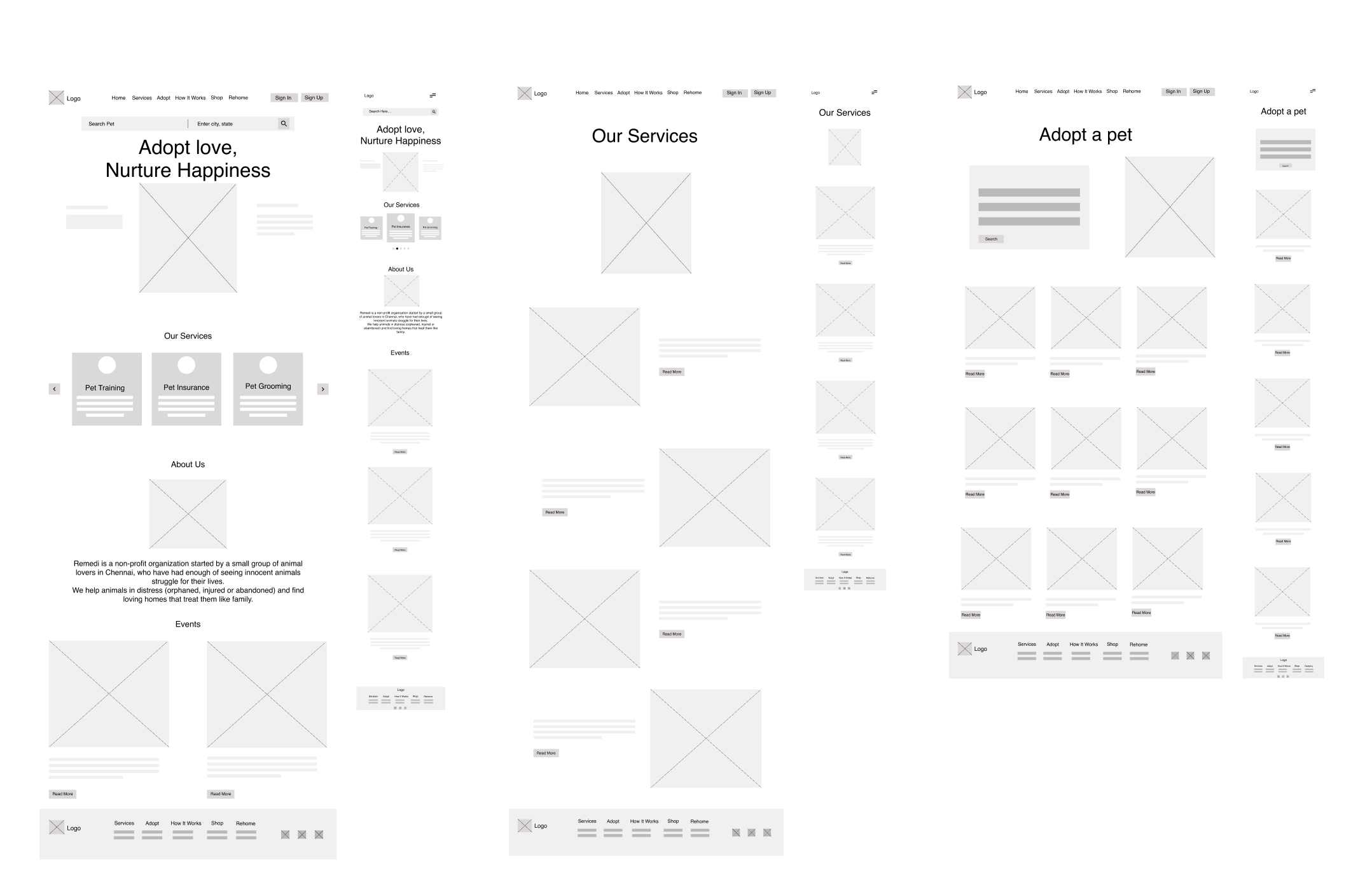
Using this flow, I created my first ideas of the main screens and how they would be connected. After a couple of iterations, I ended up with the following version.
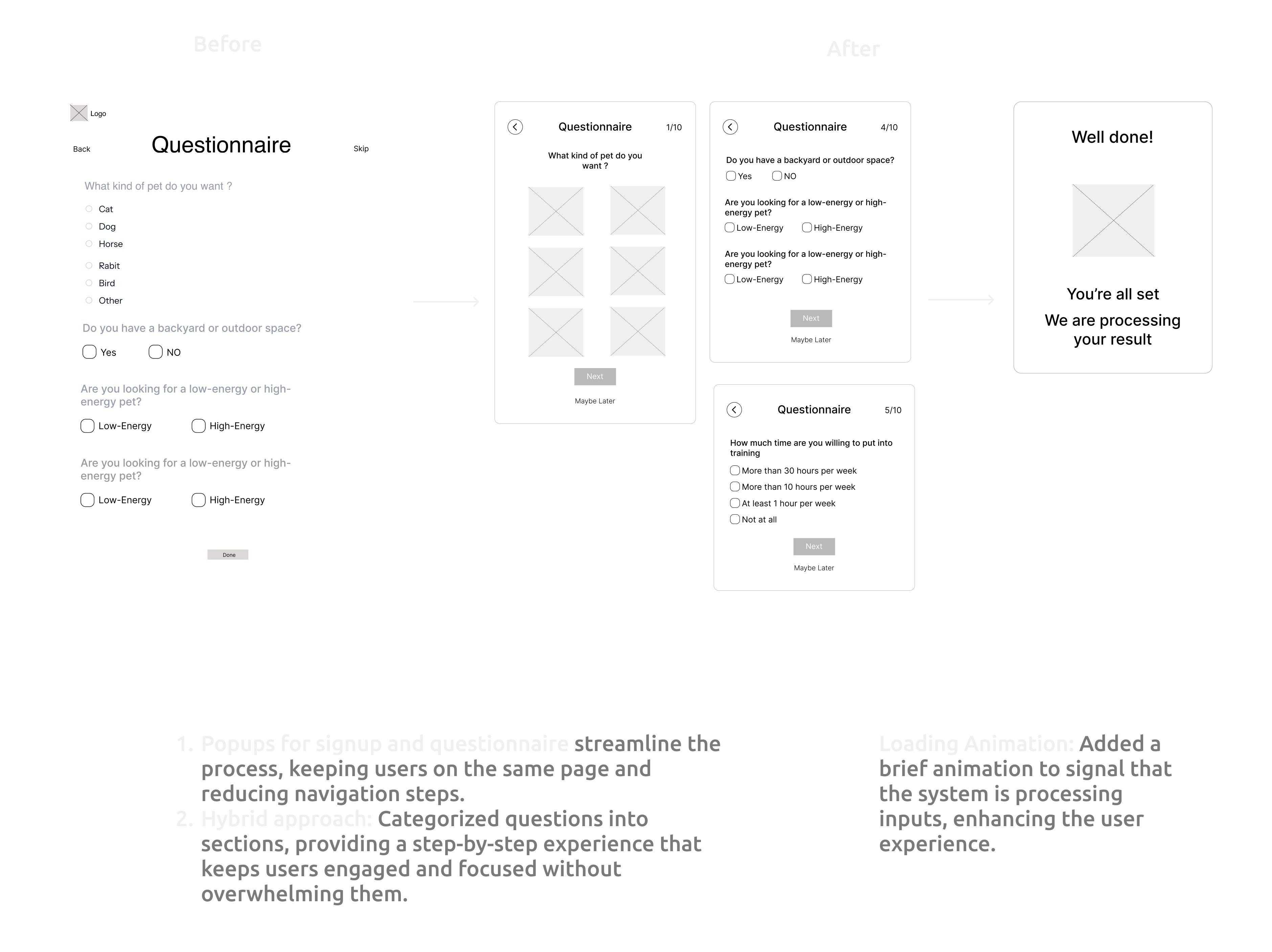
After carefully testing the wireframes with users and Stakeholders, I
made
two significant changes to improve the overall experience:
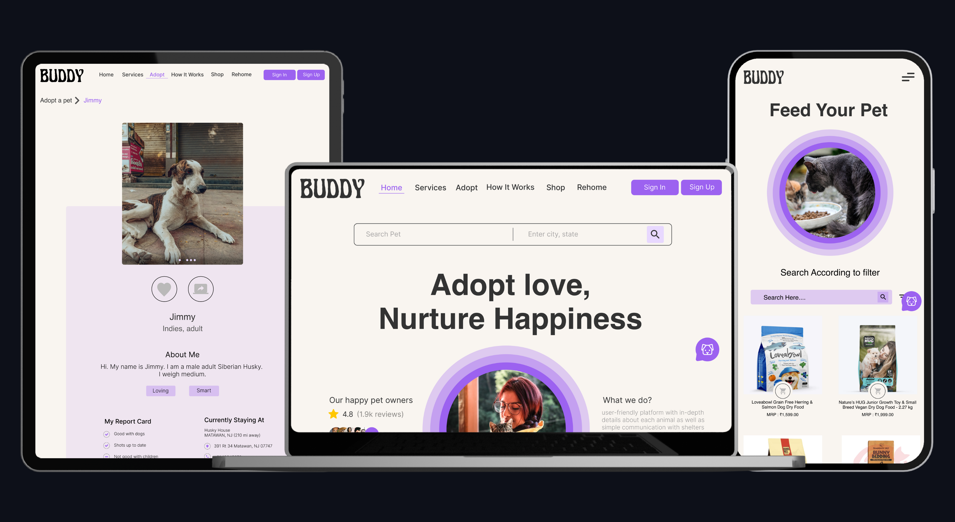
Home Screen
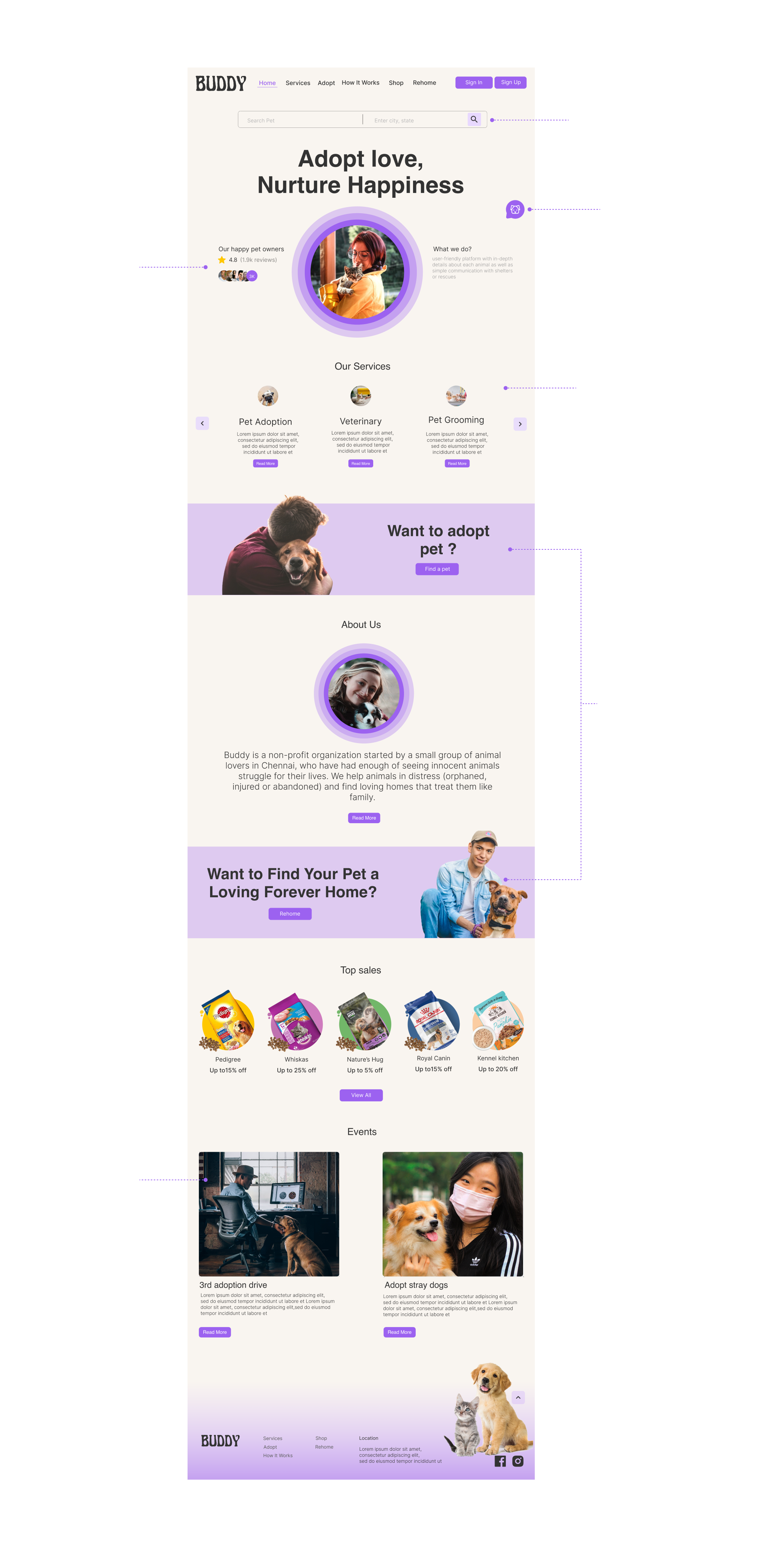
Few added features
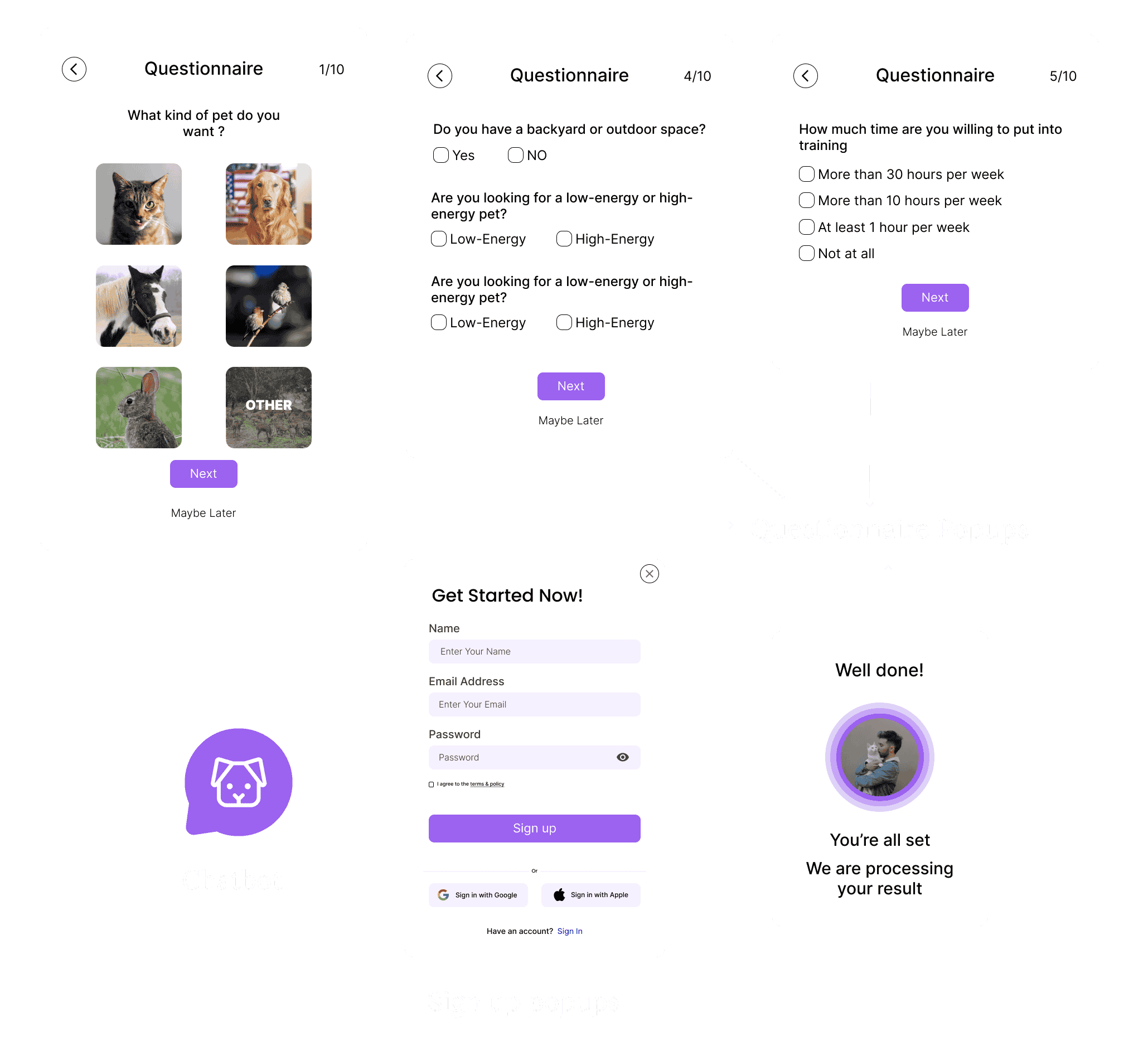
Pet Selection
After completing the questionnaire, users will be redirected to their personalized list of pets
This is the pet information page, which includes details about the pet's age and behavior, as well as a scheduling feature for walks, helping users to better understand each pet.
Prototype
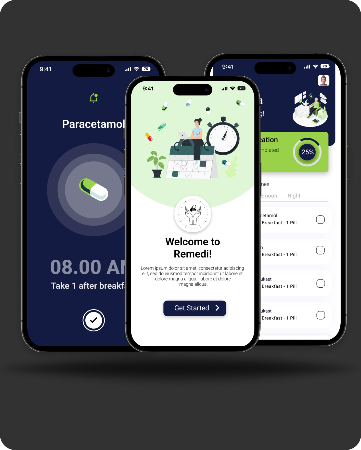
For responsiveness, here are some of the pages designed specifically for mobile devices.
After testing my clickable prototype with five users, the feedback was overwhelmingly positive. The personalized questionnaire, smooth user flow, detailed pet profiles, and essential chatbot were all highly praised 🙌, confirming the design’s success 🎉 in meeting user needs.
Here are my takeaways from designing the Buddy pet adoption website: