

What is BPR&D?
The Bureau of Police Research and Development (BPR&D) in India, established in 1970, is responsible for modernizing the country's police forces through research, training, and development initiatives. It focuses on improving police efficiency, addressing criminal justice challenges, and introducing innovative policing techniques. https://bprd.nic.in/
Revamping the BPR&D website during a hackathon by enhancing its user interface and experience, making information more accessible, improving navigation, and ensuring mobile responsiveness.
Shraddha Shinde (L) - User Research and Accessibility Issues Research
Heramba Limaye - Wireframing and Research
Bhavesh Dhake - UI Design
Figma, Miro, Excel
The Website is for?
The BPR&D website serves a diverse audience that includes law enforcement professionals seeking resources and training, legal professionals needing guidelines, researchers and students studying crime and policing. Additionally, it caters to educators looking for teaching materials, government officials requiring data for policy-making,and the general public interested in understanding policing practices and initiatives. This wide range of users emphasizes the necessity for a user-friendly and accessible website that effectively meets various information needs.
Before diving into primary research , we conducted Heuristic Evaluation.
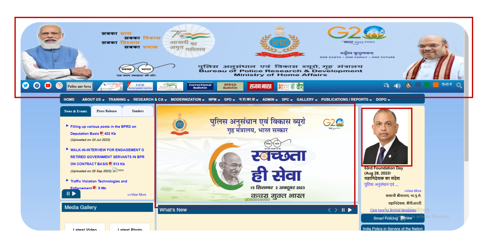
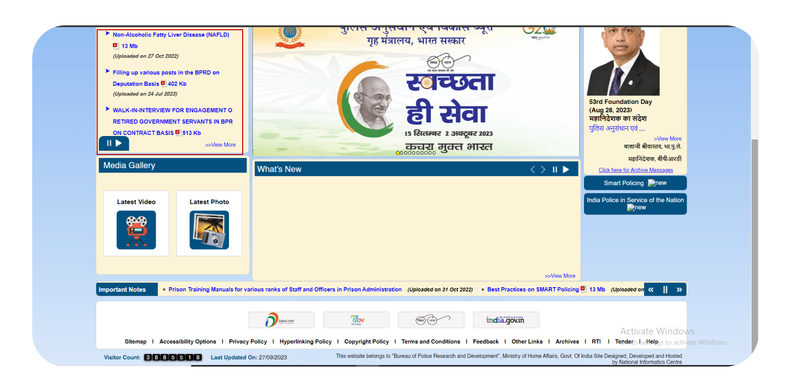
In the red boxes, we can observe poor-quality images and graphics, with some images being pixelated and irrelevant to the context. This violates key heuristics such as Aesthetic and Minimalist Design, as the visuals detract from a clean, functional interface, and Consistency and Standards, as the inconsistent quality of images creates a disjointed user experience
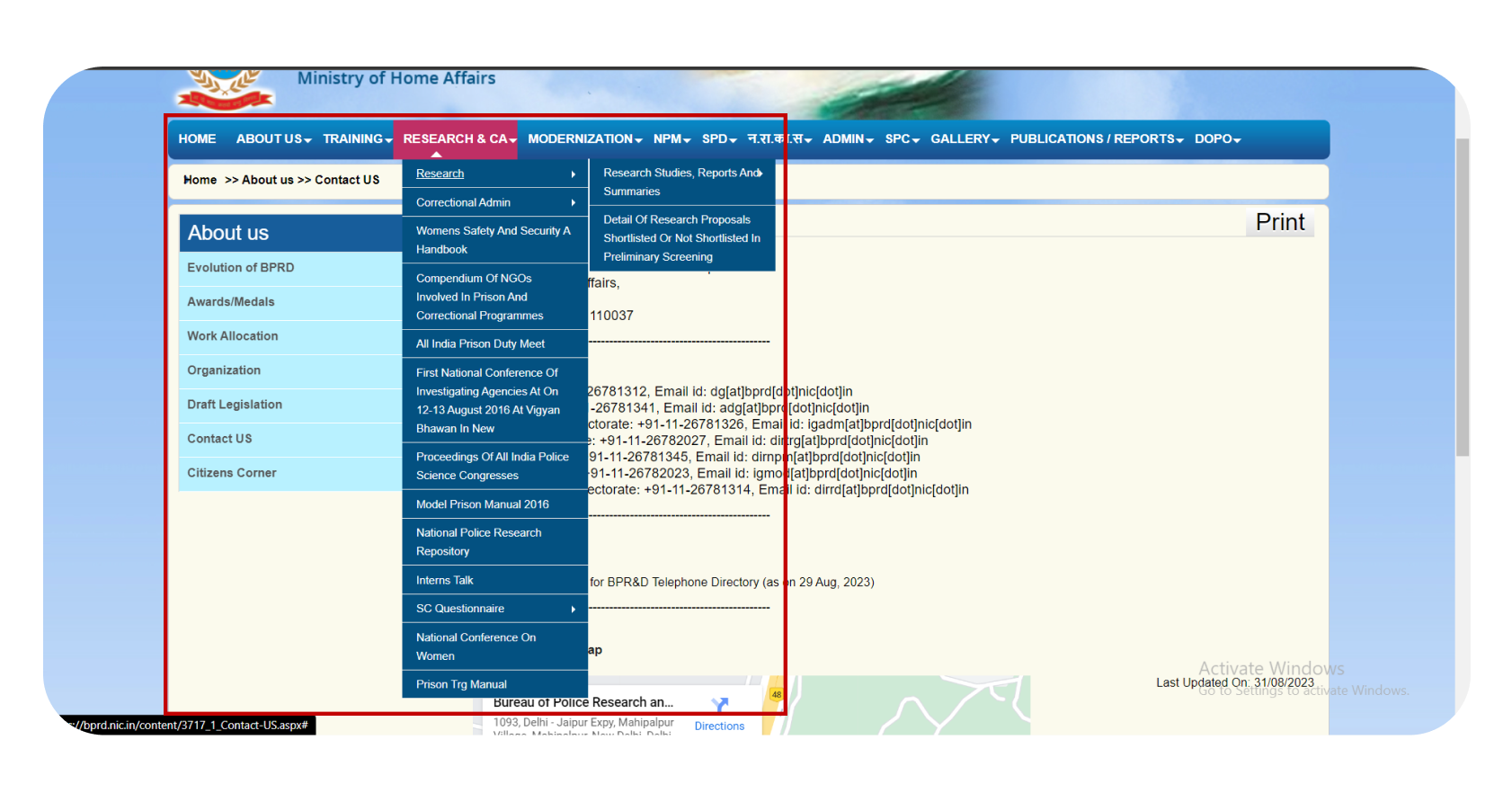
The complex and deeply nested menu is confusing for users, which violates the heuristics of Efficiency of Use, as it hinders smooth navigation, and User Control and Freedom, as users may feel lost and unable to easily find or backtrack to the information they need.
The website is not responsive, which violates the heuristic of Flexibility and Efficiency of Use, as it limits the ability of users to effectively interact with the site across different devices and screen sizes.
The text in some sections of the website moves continuously, which violates the heuristics of Flexibility and Efficiency of Use, as it disrupts readability and ease of interaction, and User Control and Freedom, as users are unable to pause or control the moving text, leading to frustration.
To understand user needs and pain points regarding the BPR&D website, I
interviewed 15 individuals of
various ages, backgrounds, and genders.
Question were about:
One participant,
who is blind,
highlighted the need for screen reader support,
prompting us to conduct additional research on accessibility issues.
Our goal is to enhance the experience for individuals with
visual impairments, cognitive challenges, or language barriers.
According to recent data, millions of Indians
with disabilities stand to benefit from these accessibility
improvements. Approximately 2.2% of India’s population
experiences visual impairments,
while many others
with cognitive disabilities and learning challenges
rely on enhanced text readability, spacing
adjustments, and alternative text for digital content.
To address these needs, we are incorporating essential accessibility
features, including:

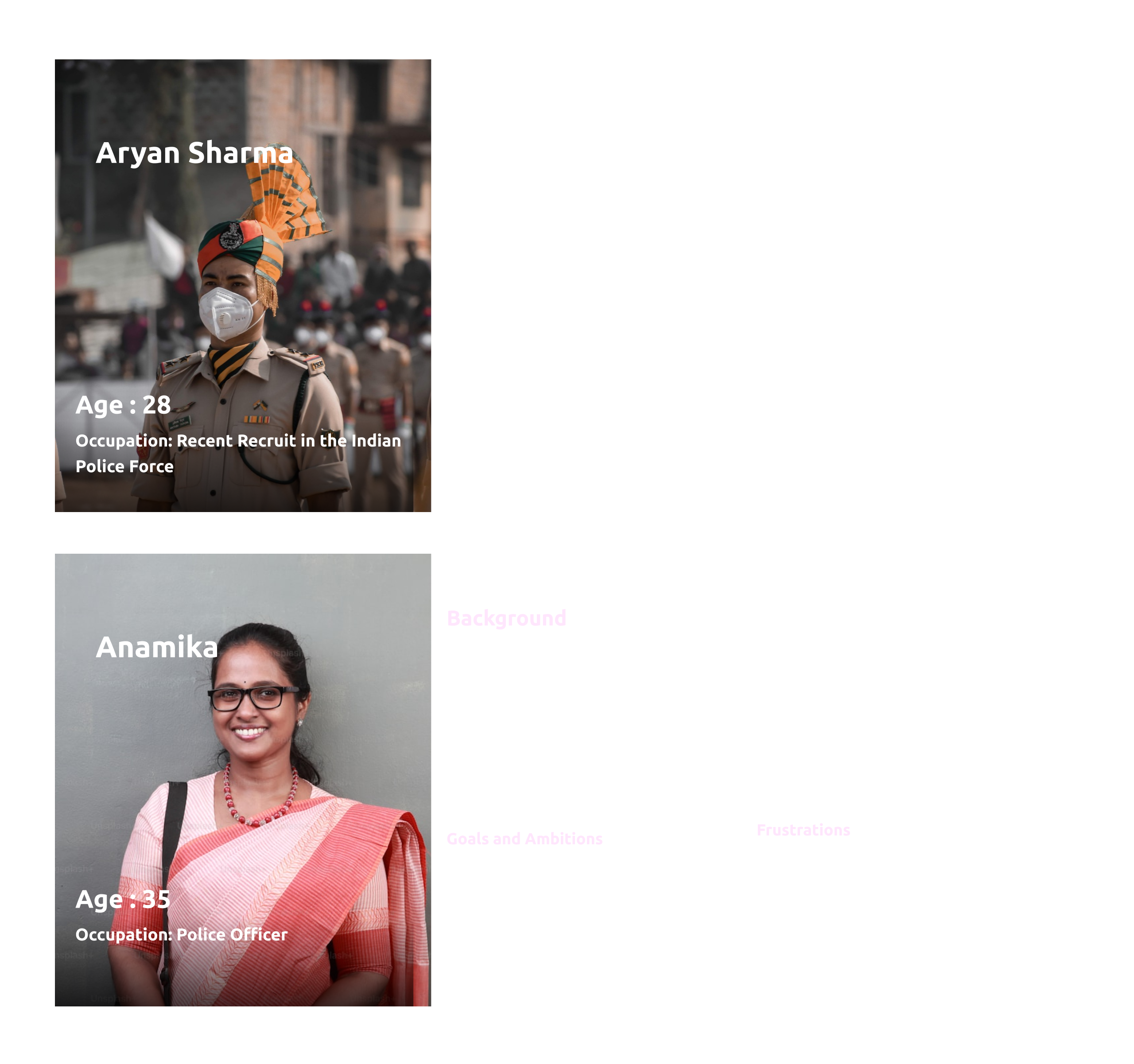
With the information in hand and combining user research learning, we
created two personas to help us
align our design better to meet their persona’s goals.
We created mid-fidelity wireframes to ensure that the UX of our app aligns with users' needs regarding usability and functionality.
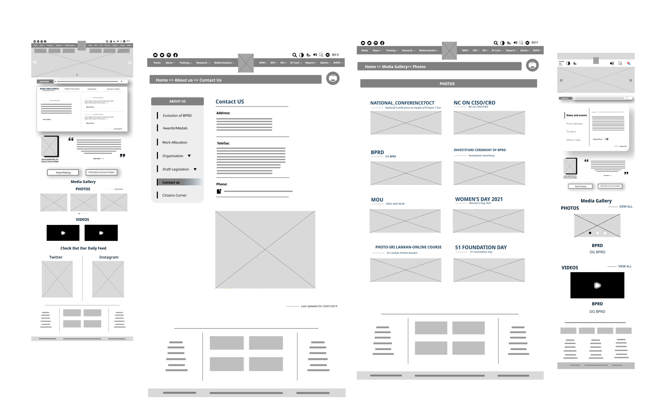
Home Screen
This dark theme page is specifically designed to be inclusive for people with color blindness, ensuring that text, visuals, and interactive elements are easily distinguishable. The design has been tested to pass all WCAG AAA accessibility guidelines, which represent the highest level of web accessibility.
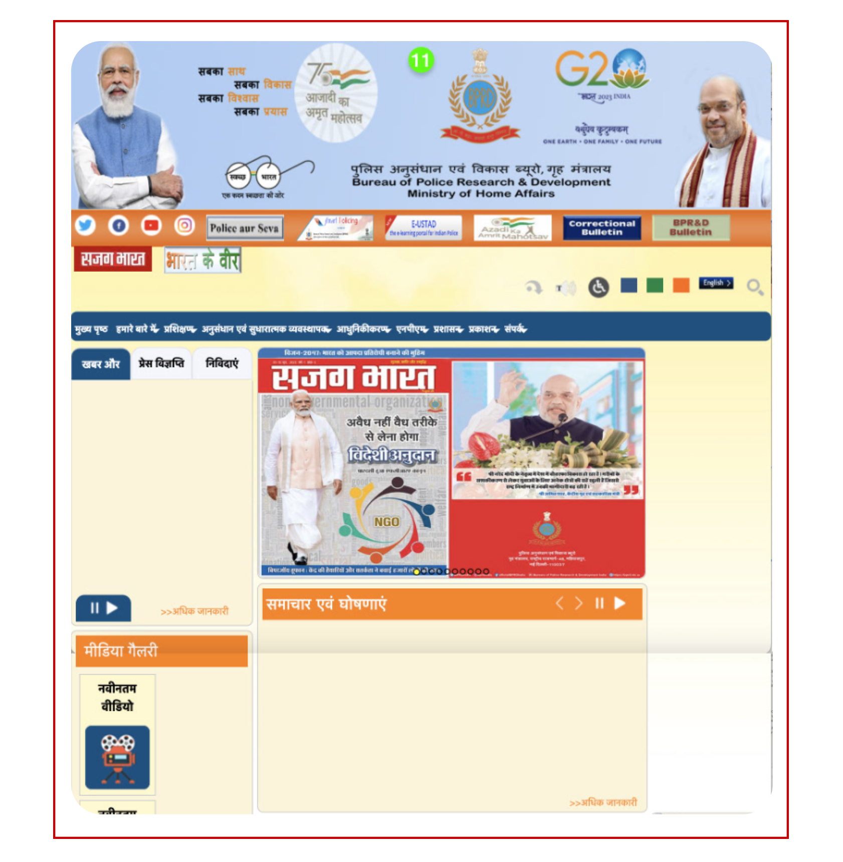
Translated page in hindi language
Responsive pages for the BPRD website, compatible with mobile and desktop, ensuring greater accessibility and usability.
Managing complex government website data taught me to enhance user experience and make information more accessible. This project also introduced me to research on accessibility solutions, broadening my skills in creating user-friendly, inclusive digital environments.
As this project was developed within a limited time, we did not have the opportunity to conduct extensive usability testing. In the future, if given the chance, we would like to carry out moderated or unmoderated usability tests. This will allow us to gather user feedback, analyze results, and iterate the design process for further improvement.